
- Home
- Services
- TECHVED AI
- Case studies
- CLIENTS
- About Us
- More

Let's get started
We believe in advancing your business growth with innovative ideations and strategies
Get In Touch


 Back
BackDesigning Adaptive UI for Multi-Device Experiences in the Modern Digital Age
#AdaptiveUI #UIDesign #MultiDeviceUX

Jay Anthony
9 December 2025 | 8 min read
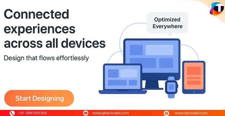
Ifthere’sone thing today’s users have in common,it’sthis:they’reconstantly switching devices. They start reading on a laptop, continue browsing on a mobile screen,maybe jumpto a tablet during a commute, and later explore the same content on a smart TV or wearable device. And as they move, they expect theUIanduser interfaceto stay seamless, familiar, and intuitive.
This constant device-shifting has created one of the biggest challenges for businesses today:How do you create adaptive, consistent, and intelligent experiences for every screen, every format, and every user?
Read on to knowwhy adaptive design matters more than ever, howUXdesignand technology likeAIare shaping the future, what modernUI/UXdesign trends areemerging, and practicalUIUXtipsto elevate your multi-device strategy. Whetheryou'rebuilding a product, upgrading awebsiteUXUI, or partnering with aUI UX design services company, these insights will help you create experiences userstruly love.
Why Multi-Device Experiences Matter Today
Your usersdon’tjust “open a website” anymore. They interact with an entire ecosystem:
- Smartphones
- Tablets
- Laptops
- Smart TVs
- Wearable devices
- Voice-enabled assistants
- AI-powered interfaces
Each device adds a new context:screen size, interaction pattern, user behavior, and even psychological expectations. This is whereUI and UX web designbecomescrucial.
When your digital product feels inconsistent across devices, users instantly feel disconnected. They abandon tasks. They drop off. They lose trust.
But when yourUIanduser interface psychologyare aligned across devices, your brand feels trustworthy, well-designed, and easy to use.
Adaptive UI: The Foundation of Modern Multi-Device Design
Adaptive UI goes beyond simple “responsive design.” Responsive design adjusts layout. Adaptive design adjustsexperience.
Here’sthe core difference:
- Responsive UI→ Resizes content automatically
- Adaptive UI→ Understands device context, user behavior, and interaction patterns, then adapts the experience
In short, adaptive UI is smarter, more thoughtful, and more aligned with real user needs.
This is whereAIcomes in.
How AI Is Reinventing Adaptive UX/UI
AI is no longer just a buzzword;it’sthe backbone ofAI,UX/UIexperiences. It helps digital products understand:
- What the user might need next
- When to simplify interactions
- Where users struggle
- How to personalize journeys in real time
Some real examples ofAI interfacesrevolutionizing UX:
- Smart navigation that changes based on user behavior
- Predictive search that reduces effort
- Layout adjustments based on the user’s device history
Most Popular
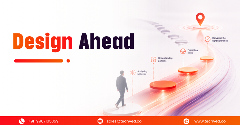
Anticipatory UX: Designing User Experiences That Predict Intent

Safe Innovation: Implementing AI Chatbots with Strict Data Privacy Guardrails

DPDP 2025 Readiness: Building Credible Platforms for a Data-First World

The Trust Economy: Viewing Cybersecurity as a Growth Strategy
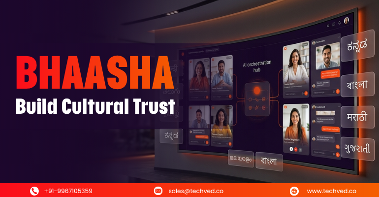
Beyond Translation: Using BHAASHA to Build Cultural Trust
Hyper-Localization: Speaking the Customer Language for Global Growth
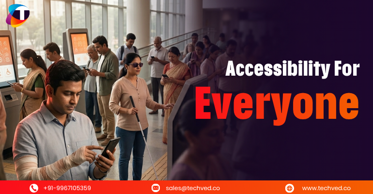
Touching the Next Billion: Designing for Permanent and Situational Disability
Written By
Jay Anthony
Marketing Head
He led efforts to develop a fully integrated marketing communications plan and growing team. He is responsible for successful corporate re-brand and update of all branded assets.

Stay up-to-date with
all new market trends and
happenings
 #AnticipatoryUX #PredictiveUX #AIinUXDesign
Anticipatory UX: Designing User Experiences That Predict Intent
#AIChatbotSecurity #PrivacyFirst #ResponsibleAI
Safe Innovation: Implementing AI Chatbots with Strict Data Privacy Guardrails
#DPDPCompliance #DataProtection #DigitalTrust
DPDP 2025 Readiness: Building Credible Platforms for a Data-First World
From Ideation To Digital Transformation
We take care of all your needs


