
- Home
- Services
- TECHVED AI
- Case studies
- CLIENTS
- About Us
- More

Let's get started
We believe in advancing your business growth with innovative ideations and strategies
Get In Touch


 Back
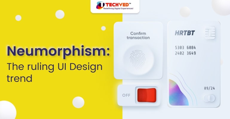
BackNeumorphism: The ruling UI Design trend
Neumorphism

Jay Anthony
29 September 2022 | 8 min read
It is important for businesses to keep up with the new UI trends in order to remain competitive. Although many services and businesses have undergone a digital transformation as a result of the pandemic, User Interface developments have also changed a bit since 2020. Every day, customers visit a large number of websites, so businesses must use extra creativity to stand out. To keep users interested and engaged, businesses rely on visual appeal and usability. The new such trend in the field of UI is Neumorphism.
The next issue that many people have is whether Neumorphism is really New?
Well, based on history, we can assume that it isn't!
Neumorphism is not a modern idea; rather, it is an ancient concept that has resurfaced in popularity. Like an old fashion trend that reappears after a period of time, or an old album that unexpectedly becomes a chart-buster. Once Again!
Neumorphism came into existence with some polishing and turned out to be a new concept in architecture. Its characterized by a minimal and reliable user interface which represents a kind of new way of dealing with Skeuomorphism. While Skeuomorphism is designed to make UIs look like your counterparts in the real world. The aim of Neumorphism is to increase the realism and touchability of interfaces.
There's no wonder that when we say Neumorphism, there are many who stare cluelessly. What exactly is Neumorphism?
In this article, we'll look at the role of Neumorphism in UI and how it's influencing UI trends.
What is Neumorphism Design?
By combining a monochromatic colour palette with subtle shadows that make the calculator's buttons feel tactile, neumorphic design borrows from both skeumorphism and flat design. The reduced contrast between foreground and background gives the calculator a soft appearance, and the overall effect is one of simplified realism. But how Neumorphism works in UI design? Well, it is a fresh approach to skeuomorphic design. Even though it is related to skeuomorphism, neumorphism is a new focus in the overall UI design service. The emphasis here is on the colour pallet rather than the difference or similarities between the physical and digital worlds.
The Combination of Minimalism and Skeuomorphism
The most intriguing aspect of Neumorphism is that it is derived from Skeuomorphism as well as other widely used design forms, such as flat designs. They both are opposites and Neumorphism falls somewhere right between them both. Neumorphic UI elements appear to be bound to the background as if they have been extruded from or inset into the background. Because of the way soft shadows are used to produce the effect, they've been labeled "soft UI" by some.
The following are the UI Design elements found in Neumorphism.
1. Color palette
Neumorphism is characterized by subtle contrast and solid colours. It's all about how you use shadows and light. The most important factor is to ensure that your element and backdrop are the same precise colour.
2. Representation
Neumorphism applies very mild and subtle effects and does not attempt to over-represent natural objects. It generates a new form that resembles a clay render (the most commonly encountered surface texture among 3D designers) of primarily analog parts from the old world.
3. Shapes
To produce an unnecessarily repetitive interface, easily accessible shapes are utilized and reused where appropriate.
4. Effects
Instead of trying for maximum realism, it uses easily available HTML and CSS effects such as Double Drop shadows, Gradients, Fill, Stroke, and, in extreme circumstances, Inner shadows, all of which can be created in their natural code forms by an average developer.
Neumorphism is the next in the line of trends, it has certainly broken the barriers on which Flat Design and Skeuomorphism stand. Neumorphism gives UIs a more realistic and tactile feel than flat nature and that’s why it doesn't resemble much of the theme that Skeuomorphism talks about.
It’s mostly because of the its cards & buttons design types. The Neumorphic cards are distinct from other design types, like material design cards, as they don't look like they float. No shadow is produced to generate this floating effect, even if the user hovers over the card. The Neumorphic card claims to extrude from the past, however. It is an elevated form constructed from the very same background material. Whereas, Buttons, in any design, play an important role. Like if you visit a page and you don't see a button, where can you click? Startled right?
Therefore, Buttons in any interface are a key UI component. They must be highly visible and alter the statements of the button as users interact. Not only in a split second but users must also be able to notice keys, they must change their colors and interact.
Neumorphic keeps their buttons classic. They designed it to be pleasing to the eye. It necessitates a low level of color contrast and a limited number of color pops. Designers are logically free to use Neumorphism to the extent they see fit, rather than trying to use the theme everywhere.
Is Neumorphism perfect?
Well, let's be honest. When every trend has benefits, it comes up with few drawbacks too. The same goes for Neumorphism. It does provide all the fairy and fresh look to the designs, but it somewhere draws a restricted line also.
Accessibility is a huge issue, and it's probably the biggest flaw in neumorphism's idea of color contrast. Every design trend has benefits and drawbacks. Trends have the capacity to breathe fresh life into predictable design patterns when handled intelligently, but problems arise when trends are shoved into applications where they do not serve consumers.
Let's look at the pros of neumorphic design to better comprehend its utility.
Neumorphism is appropriate for digital items because it is visually basic.
It makes it easier for designers to build aesthetically unified user experiences design, regardless of the number of screens in a product.
It speeds up the process of designing, building, testing, and iterating on new screens.
Designers may ensure that items remain visually consistent as they change.
The realistic properties of neumorphism can make UI components appear more tactile and may help users understand interactivity.
Here are few cons of neumorphic design pull it backwards
Neumorphism does have accessibility issues.
It may cause issues for persons who have visual impairments such as colour blindness.
Furthermore, the use of low contrast to generate a soft appearance might restrict reading and make it harder for users to distinguish buttons, icons, forms, and other critical interface aspects.
Conclusion
It's because Neumorphism, despite its flaws, can still give the designs a more practical feel. It is what users actually find pleasing and it can be best used to enhance the design style. Although this recent trend has undoubtedly influenced many designers. It's time to let their imaginations run wild and experiment with this new pattern by tweaking it a bit. Designers will have to rethink what it means to be different and fresh, and there will be obstacles along the way. However, it will be fascinating to watch them experiment with new UX/UI design styles and forms in order to produce something spectacular.
FAQs
How do you do neumorphism in Figma?
Neumorphism is a design trend that has been gaining popularity in recent years. It involves creating digital interfaces that look and feel like they are made of real-world materials.
There are a few different ways to create neumorphic interfaces in Figma. One way is to use the platform's built-in vector tools to create shapes that resemble real-world objects. Another way is to use the platform's bitmap tools to create textures that resemble real-world materials.
How do you make Neumorphism in XD?
Neumorphism is a design style that combines elements of skeuomorphism and flat design. To create neumorphic designs in Adobe XD, you'll need to use both the Shape and Pen tools. To create the illusion of depth, you'll need to use light and shadow. The basic idea is to create an object that has both a light and a dark side. The light side should be slightly elevated, and the dark side should be slightly recessed. You can use any color you like, but neutrals such as white, black, and grey are often used.
Is neumorphism dead?
There is no precise answer to this question since neumorphism is not a specific individual or thing that can die. Neumorphism is a design trend that has been growing in popularity in recent years. While it is not clear if neumorphism is currently in decline or will continue to grow in popularity, it is safe to say that it is not dead. However, some designers believe that the style is no longer popular because it looks dated and is not user-friendly.
Most Popular
Inclusive Mobile Design: Building Accessible Apps for Global Users
Anticipatory UX: Designing User Experiences That Predict Intent

Safe Innovation: Implementing AI Chatbots with Strict Data Privacy Guardrails

DPDP 2025 Readiness: Building Credible Platforms for a Data-First World

The Trust Economy: Viewing Cybersecurity as a Growth Strategy

Beyond Translation: Using BHAASHA to Build Cultural Trust
Hyper-Localization: Speaking the Customer Language for Global Growth
Written By
Jay Anthony
Marketing Head
He led efforts to develop a fully integrated marketing communications plan and growing team. He is responsible for successful corporate re-brand and update of all branded assets.

Stay up-to-date with
all new market trends and
happenings
 #InclusiveMobileDesign #MobileAccessibility #DigitalAccessibility
Inclusive Mobile Design: Building Accessible Apps for Global Users
#AnticipatoryUX #PredictiveUX #AIinUXDesign
Anticipatory UX: Designing User Experiences That Predict Intent
#AIChatbotSecurity #PrivacyFirst #ResponsibleAI
Safe Innovation: Implementing AI Chatbots with Strict Data Privacy Guardrails
From Ideation To Digital Transformation
We take care of all your needs


